Natyavan
Brand Identity Design
(Group project)
3 weeks
Software


Shortcut
Embracing the Brief’s Core
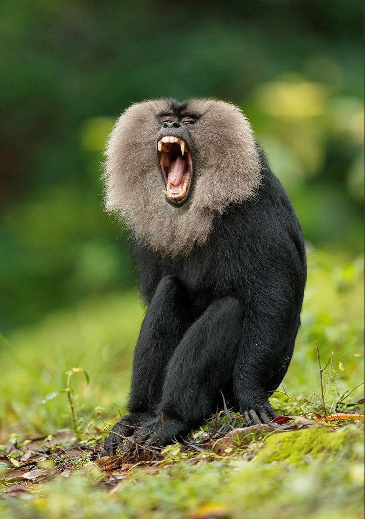
We had to create a brand inspired by the playful, leisurely nature of the Lion-tailed macaque, aiming to evoke relaxation and joy. Our goal was to bring this essence into the experiential service industry, fostering positive emotions in consumers.

My role included being part of the entire ideation process for the parent brand and the entire brand identity design of the sub brand.

Khatha
Once upon a time, Natyavan emerged, weaving passion and innovation into unique performances.
Vision
Natyavan envisions a regional stage that redefines performing arts and creates unforgettable experiences.
Mission
To foster a vibrant performing arts space that inspires and entertains through innovative productions enriching cultural experiences.
Purpose
Ignite imaginations and foster connections that bridge the stage and the soul, leaving a lasting mark on our cultural landscape.
(Story)
Text font- Beatrix Antiqua
Logo font- Bellagia Display


Adaptation Process
The blue signifies elegance whereas red depicts strength and creativity
The following typography is selected due to it being distinctive, sleek and authentic to culture. It enhances the brand even further.


.jpg)
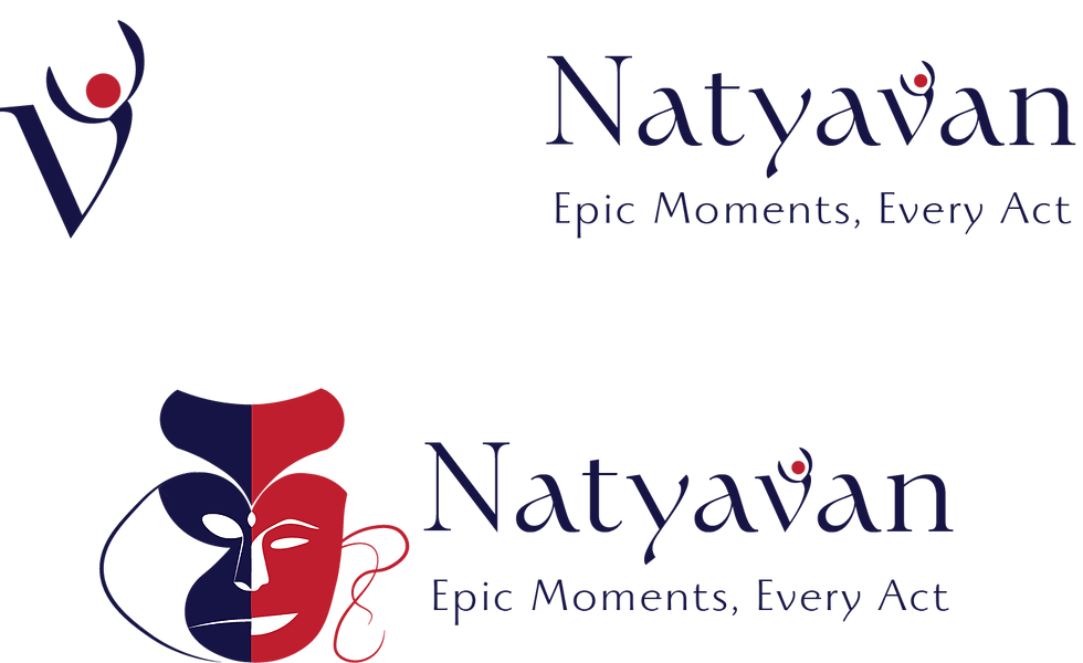
Logo Mark
Word Mark
Combination Mark


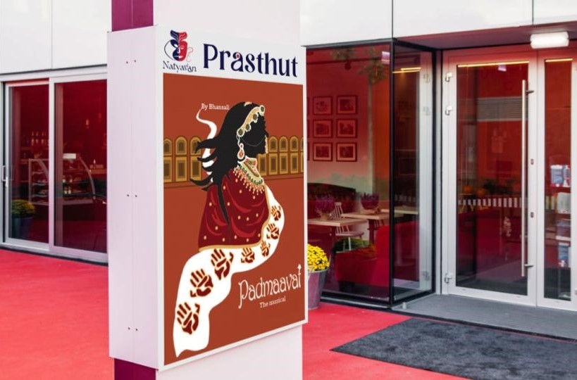
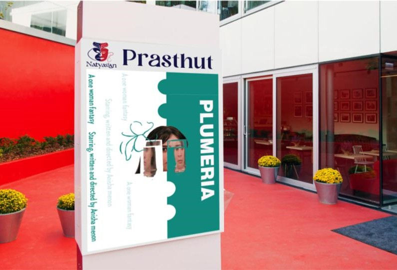
SPOTLIGHT


The word in itself is a presentation of what the audience
should anticipate. Prastut is inspired from the idea of showbill where each poster of a play shown in the theatre is
presented in this format.
(Presenting)
Prastut

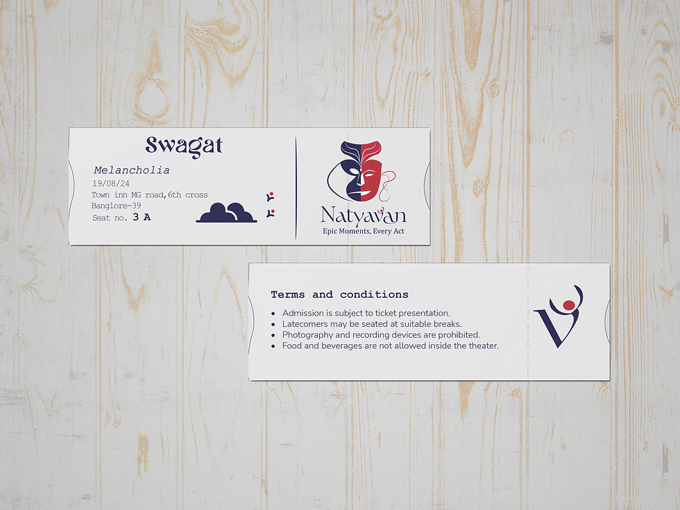
Swagat
(Welcome)
The ticket marks the beginning of an immersive experience, welcoming those who invest their
time and hard-earned money.

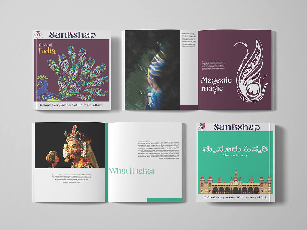
Sankshap
(Overview)
Sankshap is an overview book with production details, plot, and insights, enriching the theater experience by
deepening audience engagement with
the performance.


Our Empire
Project Framing
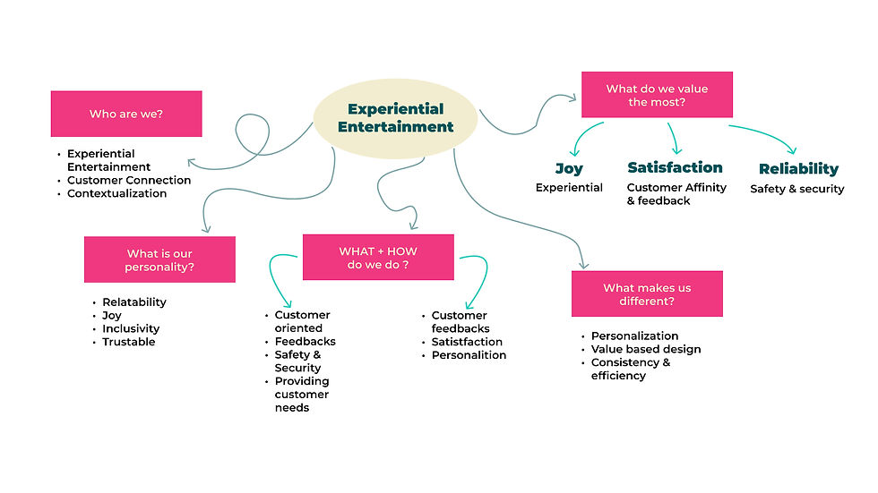
Vision
To be the premiere global venture maintaining a commitment to joy, diversity and unparalleled customer satisfaction.
Mission
Empowering individuals to create lasting memories by providing a diverse range of entertainment experience for all ages.
Purpose
To immerse the user in an engaging experience propelling them to escape from reality.
(Parent brand)
Adaptation Process


Logo font- Platonica
Text font- Montserrat
This San serif typeface contains rounded edges which communicates playfulness that the brand stands for.

Learning Crescendo

Despite some challenges,
working in a group made me
learn a lot.
I learnt what are the fundamentals of brand design and what needs to
be done right.
Learnt how to match the characteristics and essence of the chosen animal
to a brand.
To do the right thing
is very Important.
Credits to:
Advika AB
Aarya Latkar
Aayushree Panchal
Aditi Kulkarni
Bhuvi Kulkarni


